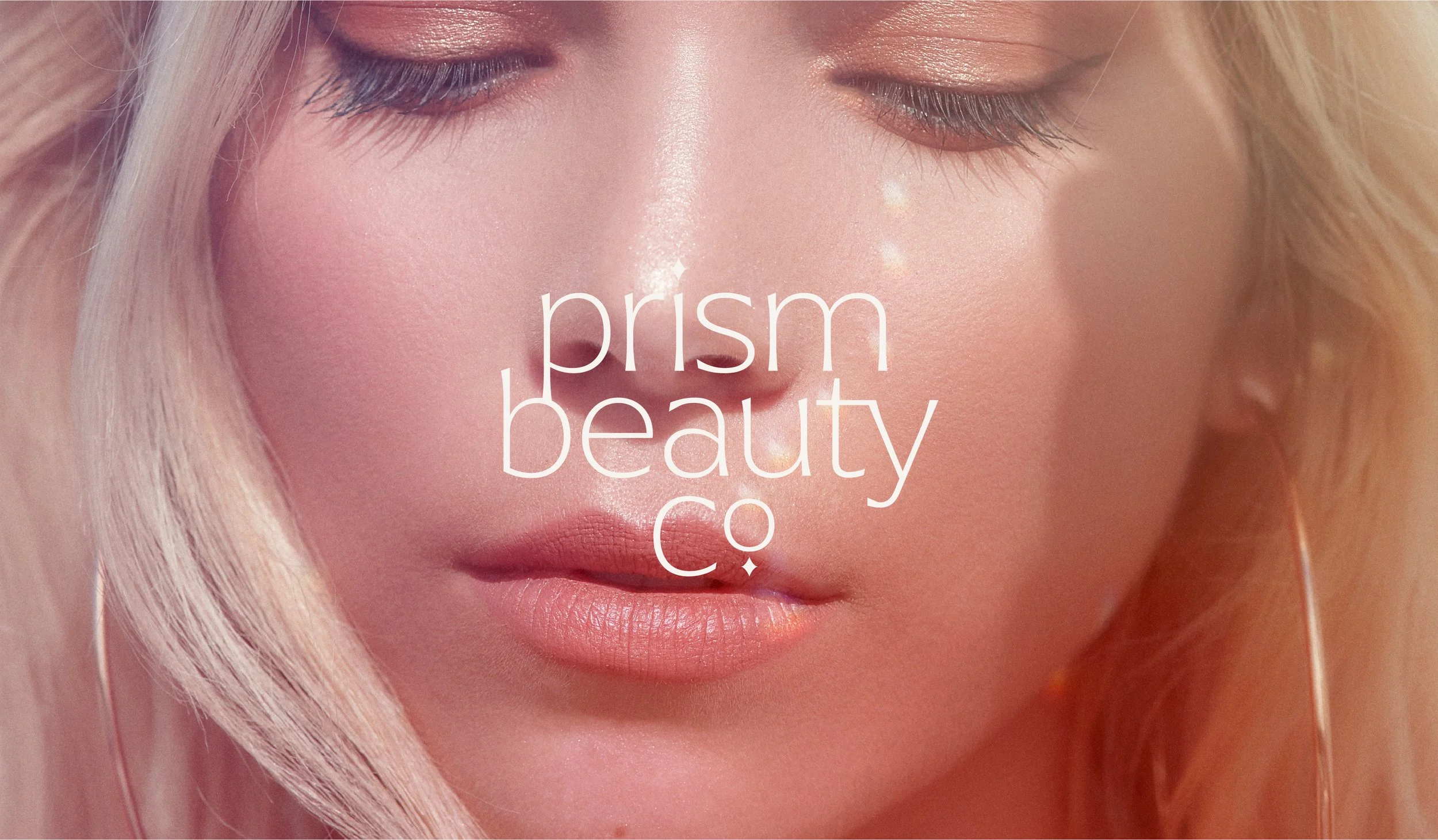
Prism Beauty Co. is a conceptual clean beauty brand with a modern twist. It’s mission is to give people everywhere a chance to show off their authentic selves in a fresh and fun way while navigating a world full of photoshop and AI.
CHALLENGE
Create a visual identity for a clean beauty brand, that feels fresh, modern, and feminine without relying on expected “clean beauty” tropes. The brand needed to stand out on shelves and digital platforms while clearly communicating its values through forward-facing packaging.
SOLUTION
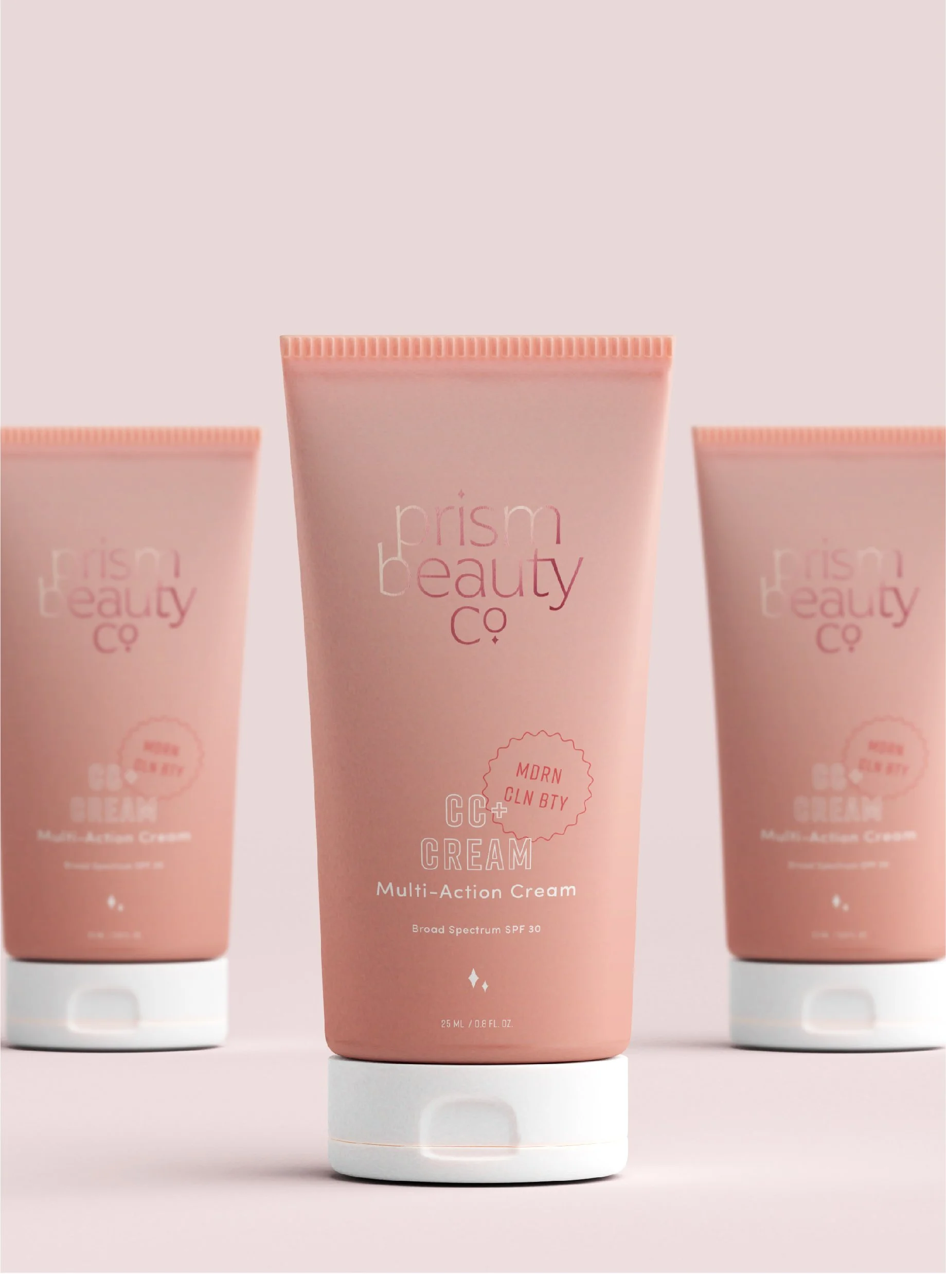
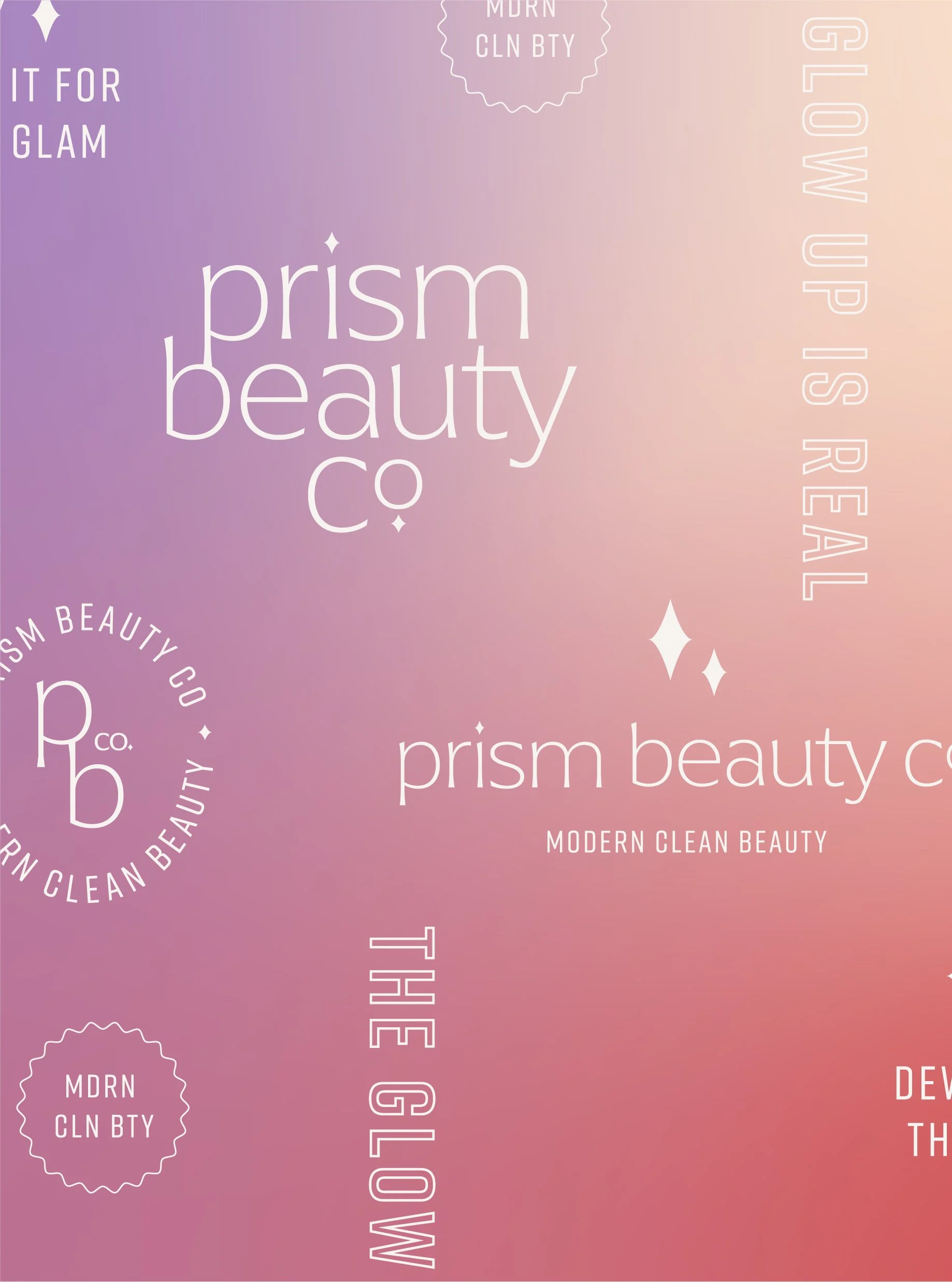
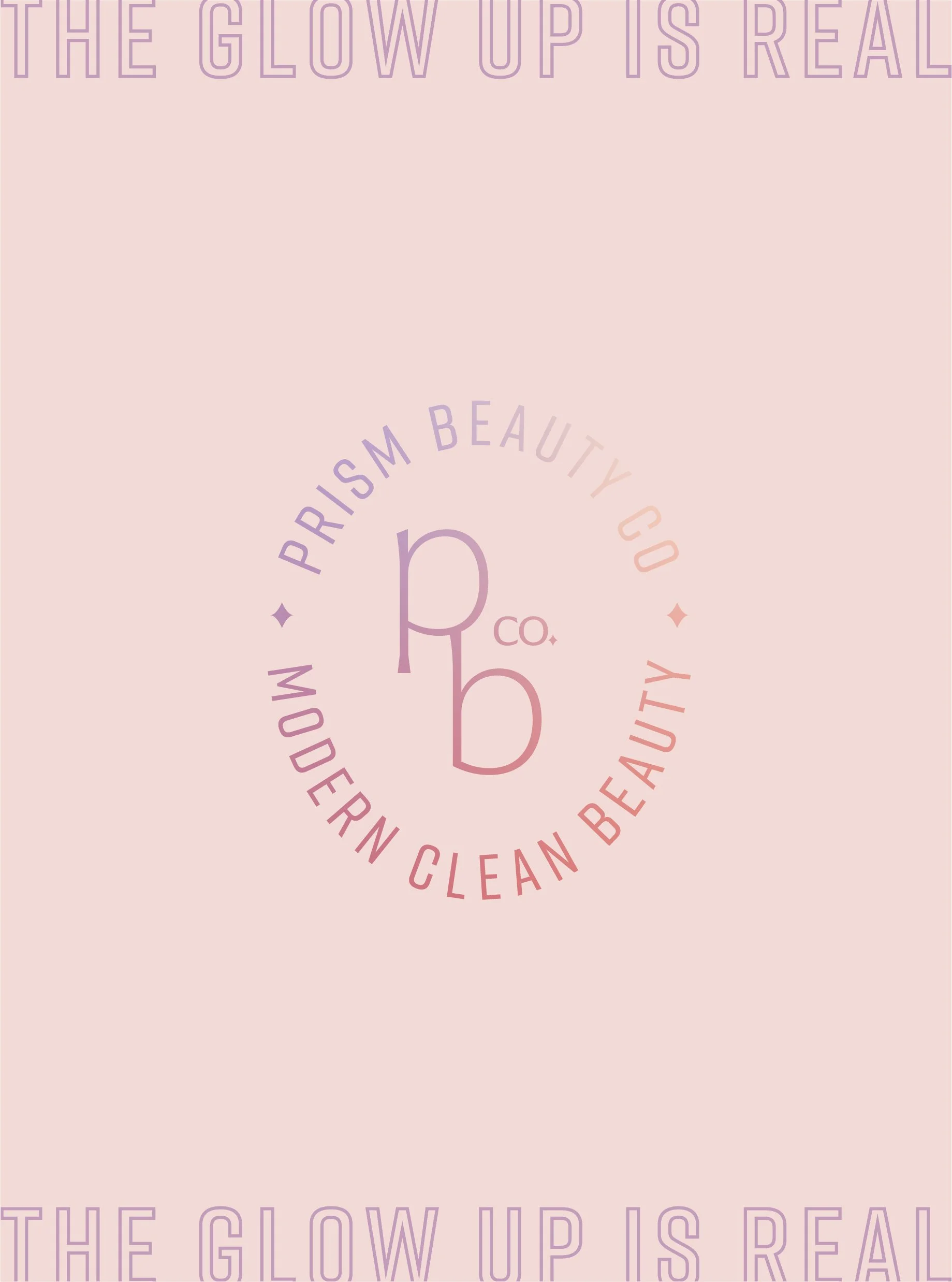
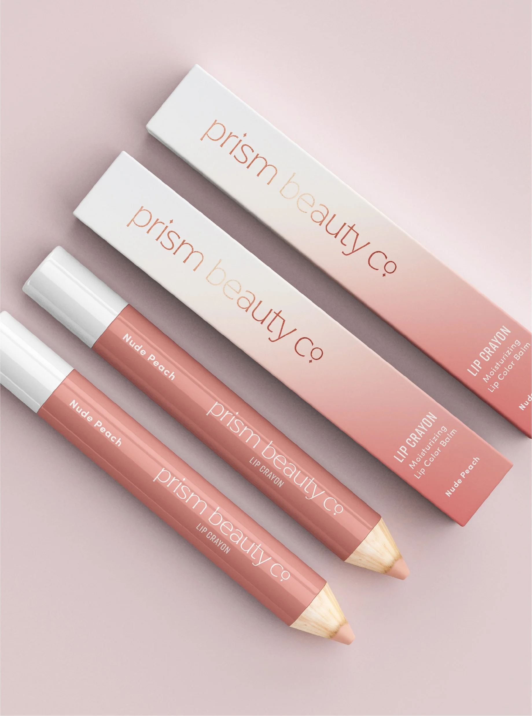
I designed a modern, feminine identity anchored by soft gradient blurs to convey luxury and approachability without leaning into predictable organic aesthetics. The logo features a refined, whimsical typeface that’s not quite a sans-serif and not quite a serif to reflect the individuality of the people the brand serves, paired with a subtle sparkle element as a nod to both the name Prism and clean beauty.
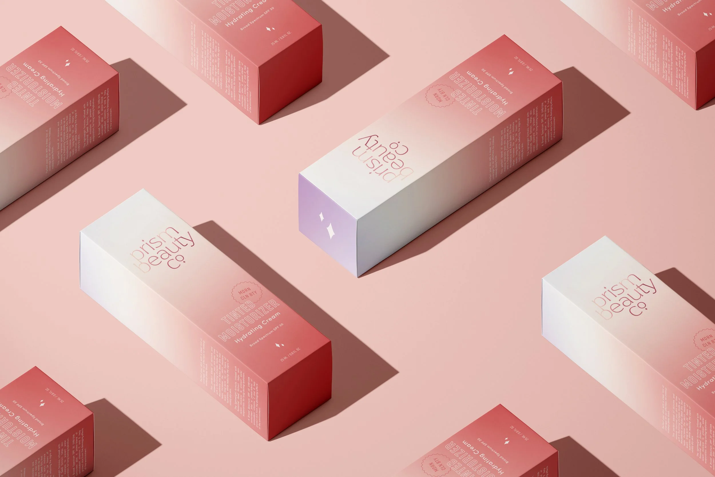
To balance the elegance of the logo, I developed a bold, playful font suite used across brand marks, packaging, and digital assets, allowing for impactful, flexible applications. The packaging was designed as the centerpiece of the brand experience. I ensured essential product information and the “Modern Clean Beauty” value proposition are immediately visible. Gradient finishes and optional rose gold foil elevate the look, creating a fun yet luxurious presence designed to live beautifully both on retail shelves and in everyday spaces.
KEY TOUCHPOINTS
Branding, Packaging Design